
Maps, Apps, and Naps… what do these three things have in common (besides my attempt to spit “hot fire” rhymes)? Navigation. Specifically, navigating our human experiences. Many aspects of our lives can be thought of as a navigation—navigating from one job to another, navigating from the movie theater to the grocery store, navigating from a fiesta to a siesta.
Each of these life experiences shape us and we shape each experience. In essence, we leave little traces of our lives in each experience space. What the internet and related “share what you’re doing” technologies have done is to record these traces of our lives. By the way, I think it’s kind of interesting that one of the very first internet browsers from the early 1990’s was called Netscape “Navigator”.
How best can we navigate our lives in the future? Past is prologue, and economic insecurity is poison. So let’s take it back to old school R&B in the 1990s. Actually, let’s take it way back. One of the earliest known maps dates back over 14,000 years ago to a prehistoric hunting map in Spain. In ancient Greece, mapmaking was seen as a critical tool to help them connect with economic opportunities. The first ancient Greek to draw a map of the known world was a man by the name of Anaximander of Miletus. Miletus was located in a strategic position to profit from the expanding commerce of the Mediterranean.
If humans first used maps to navigate economic opportunities in their known world, then what are we capable of doing today (and tomorrow)? First, let’s start with what we know about our world.
According to research from LinkedIn– the world’s largest professional network, there are approximately 3 billion people in the global workforce. And according to the International Labour Organization, economic insecurity is a global crisis.
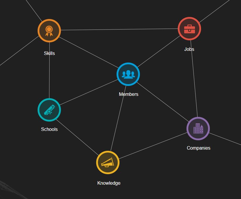
LinkedIn’s vision is to create economic opportunity for every member of the global workforce by developing the world’s first economic graph. To make this happen, LinkedIn is leading the way to digitally map the global economy as follows:
- A member profile for every professional
- A company profile for every company in the world
- A representation of the jobs and skills required to work at these companies
- A presence for every higher education institution that enables individuals to obtain the skills required to get the jobs at these companies
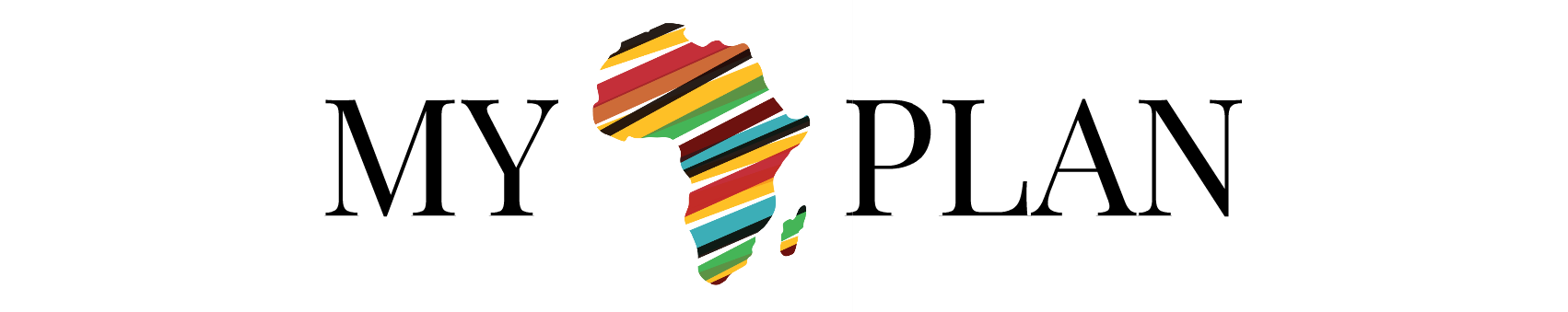
In the spirit of LinkedIn’s economic graph, I believe the global economy is big enough for all of us to navigate. In 2011, I started a business development initiative called M.A.P. – My African Plan. This is how I give back. Over the years, I’ve had the privilege of working with small businesses and large corporations with one mission in mind: To build on how economic growth in Africa can lead to global economic security.
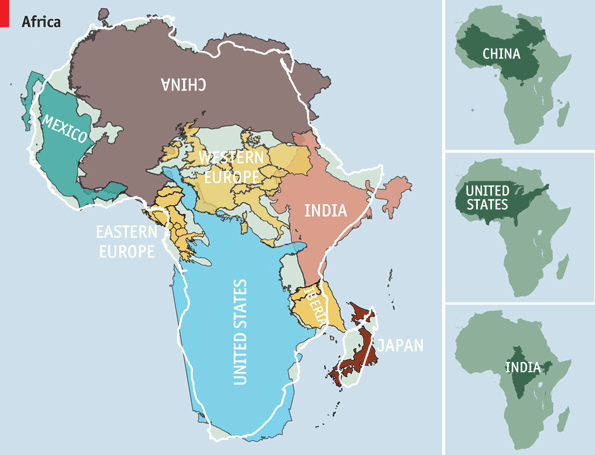
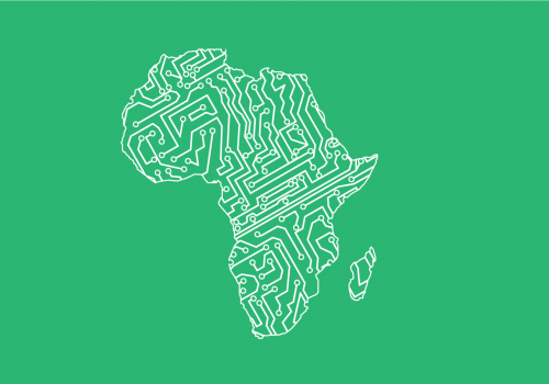
Africa is bigger than it looks on the map. It looks about the same size as Greenland under the Mercator projection, for example, even though it is in fact 14 times bigger. This was not a huge problem for 16th-century sailors who traded mostly around and not necessarily within Africa. But now the continent of Africa has evolved from the first cradle of civilization to the last investment frontier of the global economy. Of all the continents, Africa has the most potential to positively impact global economic security. The world’s youngest population resides in Africa and I believe there are over 50 Reasons to Invest in Africa. Oh by the way, Bill Gates agrees with My African Plan.